EAGLE SOLUTIONS
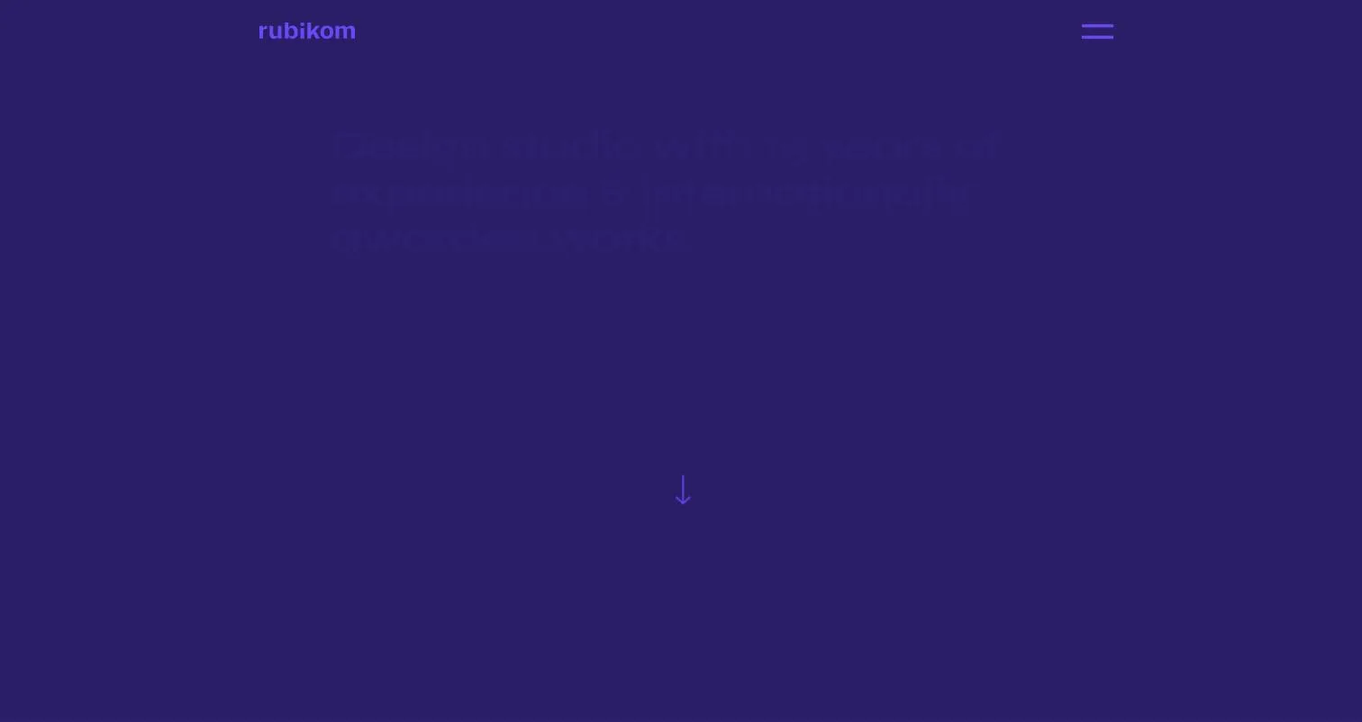
I contributed to the development of the Rubikom design studio website, in a partner collaboration.
The challenge
Rubikom is an internationally awarded design studio with 15 years of experience. On a partner site like this, the developer's job is unusually easy to state and unusually hard to deliver: do not ruin it. The design is finished, considered and award-winning. The question is whether the browser shows exactly what the studio designed.
The solution
- Pixel-accurate implementation: keeping the designed typography, spacing and proportions at every screen size, not only at the two in the mockup.
- A WordPress base in which the work and the studio introduction are editable by the studio.
- Speed: visually demanding sites tend to work with heavy imagery, which has to be served without slowing things down.
- Technical SEO foundations and a mobile-friendly build.
My contribution
I worked on this project in partnership, on the development side. The design and creative concept are Rubikom's work. This split works well because the studio can focus on design while the technical side of implementation does not consume their time.
The result
An awarded studio's website that gives back in the browser what it promised in the mockup. We have kept working together since the project, which in the case of a design partner is the most telling feedback on implementation quality.
When the client is the designer
At a design studio's website the usual workflow inverts. I do not decide how it looks: the design is done, considered, and every pixel has a reason. My job is for the browser to produce exactly what the mockup shows: the letter spacing, the grid line, the image ratio, the spacing rhythm. That is stricter work than a project with a free hand: where an average client would not notice a two-pixel difference, the designer sees it instantly. In exchange it is far faster, because there are no rounds about the design.
Showing the work: the portfolio is the product
At a studio the gallery of work is the offering itself. The rebrands, identities and campaigns each got their own page in the same structure: the brief, the solution and images of the result. The identical structure matters for two reasons. It lets the visitor compare projects, and it lets the studio add new work without rethinking the site – they fill in a template and they are done.
Large images, fast site
On a visual portfolio the images carry most of the content, and the same images eat the speed. Sizing, modern image formats and loading order were therefore the starting condition, not an afterthought: above-the-fold content arrives immediately, and the lower part of the gallery only when the visitor gets there. At a design studio a slow site is itself a bad work sample.
What exactly I did
In this project I took part on the development side: the design, the identity and the content are Rubikom's own work. My part was making the designed appearance work precisely, fast and maintainably in the browser. I have kept working with the studio since. For a design partner that is the most telling feedback on implementation quality.